How a Technical Co-founder Spends their Time: Minute-by-minute Data for a Year
Updates
2016-08-30 There was some lively discussion about this article on Hacker News.
I’m co-founder and CTO at Overleaf, a successful SaaS startup based in London. From August 2014 to December 2015, I manually tracked all of my work time, minute-by-minute, and analysed the data in R.
Like most people who track their time, my goal was to improve my productivity. It gave me data to answer questions about whether I was spending too much or too little time on particular activities, for example user support or client projects. The data showed that my intuition on these questions was often wrong.
There were also some less tangible benefits. It was reassuring on a Friday to have an answer to that usually rhetorical question, “where did this week go?” I feel like it also reduced context switching: if I stopped what I was doing to answer a chat message or email, I had to take the time to record it in my time tracker. I think this added friction was a win for overall productivity, perhaps paradoxically.
This post documents the (simple) system I built to record my time, how I analysed the data, and the results. The main things I learned were:
- I tracked a bit over 50 hours of actual work per week on average. I am more skeptical of the fabled 130 hour work week.
- My management time increased by 230% as the development team grew by 200% (2 to 6), but interestingly my time in meetings decreased by 70%.
- My development time stayed pretty much the same, but that was mainly because it shifted from the workweek to the weekend.
I also learned a lot about regression in the course of analysing the data. I wrote up a detailed and I hope accessible Appendix about it, for those who are interested in the nuts and bolts.
The CTO role is a very diverse one, and I don’t expect that the results here will be true in general. This is just my story. I hope it is an interesting one, and it is uniquely backed by data!
Background
I should probably say a bit about the company for context.
My co-founder and I started Overleaf at the end of 2012. By August 2014, when my time tracking experiment began, we’d been through an accelerator called Bethnal Green Ventures, hired our first developer, for a total of 3 staff, and raised a seed round from Digital Science, a trade investor in London. By December 2015, when my experiment ended, we were up to 9 staff, 5 of whom were developers reporting to me. We started out mainly B2C, but we have become increasingly B2B as we try to sell to universities and scholarly publishers. We’re now up to about 400,000 users.
The product is an online collaborative editor like Google Docs but specialised for scientific papers — it does an excellent job of typesetting equations, figures, tables, references, etc., mainly by using the venerable LaTeX typesetting system under the hood. So, we’re a pretty geeky company, where crazy experiments like this one are encouraged.
Methods
You can find out more about how I collected and processed my time tracking data in this section, or you can just skip to the graphs!
The metime App
Update 2016-08-30: I’ve now open sourced metime in case you want to look at it in more detail.
I built a simple web app to record my time. There are many time tracking apps out there, but I wanted something I could customise. Since it was written in meteor, I called it “metime”. It won’t win any awards, but it did the job. It looked like this:
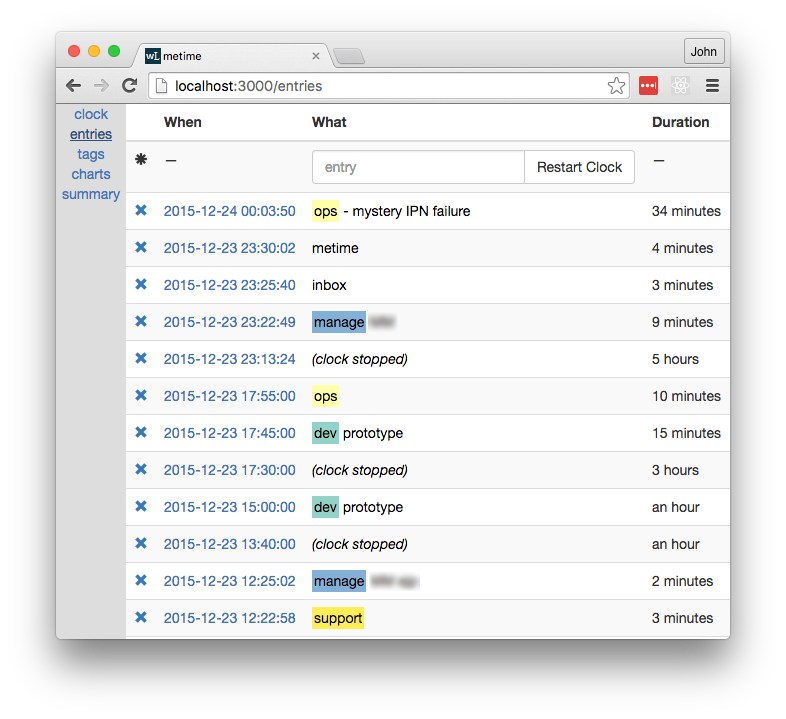
The key points were:
- At the end of each activity, I recorded an entry in the app to describe it.
- Each entry comprised one or more tags and an optional note with more details.
I used a simple text format for ease of entry. Tags were delimited by whitespace, and the tag list was separated from the notes by a hyphen.
For example, at the top of the screenshot, at 2015-12-24 00:03:50, I finished an activity tagged as ops and added a note to say that I was trying to debug a “mystery IPN failure”. The previous entry was at 2015-12-23 23:30:02, so the duration of that ops activity was 34 minutes.
If I stopped working after an activity, I’d hit the “Restart Clock” button when I got back to working. This created a special (clock stopped) message. For example, I was off the clock from 17:55:00 to 23:13:24, or about 5 hours, probably to eat supper and spend time with the family.
Of course, I sometimes forgot to make an entry. In that case, I’d make several entries at once and then edit the timestamps to get roughly the right durations. That’s why some timestamps are suspiciously round numbers. It was a pain to do this, which provided an added incentive to track things in real time.
The Tags
I decided on tags rather than categories, so I could tag a business meeting as biz and meeting, for example. The app recognised and colour coded some tags, but any word before the dash was considered a tag. I also tagged people, projects and clients (blurred in the screenshot above), but for obvious reasons I must keep that data private.
As often happens with tags, my tagging habits changed over the course of the experiment, so at the end I had a fairly long and laborious task to merge the various tags into a more consistent set for the analysis in this post. The main tags and their meanings were:
biz: admin, sales, marketing, investment, supplier management, managing user feedback, metrics and analyticsdev: coding, prototyping, wire framing, operations, bug investigation and bug fixinghiring: reading CVs, interviews, contracts, meet-ups, dealing with recruitersinbox: keeping up with email and notificationsmanage: personal planning, sprint planning, training devs, 1:1s, equipment, code review, retrospectivesmeeting: scheduled meetings and callsmetime: time spent tracking time in my app (and some time building the app)qa: manual testingsupport: end user support
Data Processing
Some additional processing was required to treat timezones, daylight savings time and holidays correctly.
The app didn’t record the time zone with each message, which it probably should have. For ‘time of day’ calculations, the time zone is necessary in order to take into account Daylight Savings Time and also travel, since I had quite a few trips to the US and the continent. I went back and manually added the time zone data in, based on my calendar.
I did not think it would be necessary to have a special annotation for holidays, but just including them as ‘clock stopped’ caused some fairly large outliers, because a week spent on holiday is clearly not a typical week. So, I manually annotated my holidays as well. (I did take some holidays! Pro tip: if you really want to get offline, go to China; the great firewall will protect you from most email.)
Results
The resulting dataset was a table with 11,978 entries between 2014-08-17 and 2015-12-23, a span of 493 days. Each entry had a start time (UTC), time zone and a duration (in seconds) and one boolean column for each tag. There was also a stopped pseudo-tag, which indicated that the clock was stopped. The table looked like this for the later part of the screenshot above:
              start            tz  duration holiday stopped   biz   dev hiring inbox manage meeting metime    qa support
...
2015-12-23 17:45:00 Europe/London   600.000   FALSE   FALSE FALSE  TRUE  FALSE FALSE  FALSE   FALSE  FALSE FALSE   FALSE
2015-12-23 17:55:00 Europe/London 19104.000   FALSE    TRUE FALSE FALSE  FALSE FALSE  FALSE   FALSE  FALSE FALSE   FALSE
2015-12-23 23:13:24 Europe/London   565.000   FALSE   FALSE FALSE FALSE  FALSE FALSE   TRUE   FALSE  FALSE FALSE   FALSE
2015-12-23 23:22:49 Europe/London   171.000   FALSE   FALSE FALSE FALSE  FALSE  TRUE  FALSE   FALSE  FALSE FALSE   FALSE
2015-12-23 23:25:40 Europe/London   262.252   FALSE   FALSE FALSE FALSE  FALSE FALSE  FALSE   FALSE   TRUE FALSE   FALSE
2015-12-23 23:30:02 Europe/London  2028.444   FALSE   FALSE FALSE  TRUE  FALSE FALSE  FALSE   FALSE  FALSE FALSE   FALSE
I marked 41 of days as holidays and excluded them from the results that follow. That left 452 days, with an average of 26 entries per day. Now on to the graphs!
Time on the Clock
Perhaps the most basic question: how much time did I spend working? I averaged 52h per week on the clock (dotted horizontal line). The dip in May – June 2015 was due to time around a holiday.

These figures come from a fairly strict definition of “working”. If I took a few minutes to refill my mug or stretch my legs or go to the toilet or read something on Hacker News, I stopped the clock, so it did not count as work.
In an industry where we talk about 130h work weeks, 52h is nothing to boast about, but I don’t think I’ve ever been called lazy. I didn’t track my non-work time, but I nevertheless became more conscious of how I was spending it. Several hours each day were taken up just by eating, commuting, hygiene and other sundries. Thinking back to those weeks where I managed even 70 hours on the clock, it was typically because I avoided (or neglected) some of those things. And of course we all need to sleep, and when times are bad, you’ll be glad to have at least some life outside of work. A startup is a marathon, not a sprint.
Time by Tag
Next, how did I spend that time? Over the whole period, the two largest tags were biz and dev, at about 18h per week each, on average. Management and meetings came third and fourth, followed by hiring and customer support.

It’s worth noting that some tags often coincided (e.g. biz meeting), so it’s not always meaningful to add up the durations for different tags. Comparing between tags is OK, however.
It’s also worth noting that I tracked the time I spent tracking my time with the metime tag. (Very meta.) I only added a metime entry when I spent more than a minute or so on tracking, which was usually when I was catching up after having missed several entries. So, it’s a bit of an underestimate, but it was fairly low, at about an hour per week.
Trends over Time
How did the way that I spent my time change over time? The full per-week and -tag data are too much for one plot and also rather noisy, so to answer this question I ran several kinds of regression and settled on log-linear regression. The gory (but interesting!) details of the models and results are in the Appendix. The notable trends (and non-trends) were as follows.
| Tag | Initial h / week | Final h / week | % Change | p < 0.05 |
|---|---|---|---|---|
| biz | 20 | 13 | –36% | ✓ |
| dev | 17 | 16 | –3.1% | |
| inbox | 1.3 | 2.9 | 120% | ✓ |
| manage | 3.1 | 10 | 230% | ✓ |
| meeting | 8 | 2.3 | –72% | ✓ |
| qa | 1.2 | 2.8 | 120% | ✓ |
| support | 3.3 | 1.6 | –51% | ✓ |
| (total time on the clock) | 49 | 53 | 8.6% |
For example, my average time spent on biz each week decreased by 36% from 20h to 13h over the course of the experiment. The tick in the last column indicates that this trend was statistically significant at the p = 0.05 level — that is, despite the presence of week-to-week variability, we can be fairly sure that there really was a downward trend on average for this tag.
Looking at the other statistically significant trends, the overall picture is that as the team grew, my role changed to involve a lot more management (manage), quality assurance (qa) and responding to email (inbox). It is perhaps surprising that there was a downward trend in meetings (meeting), despite an upward trend in management. That is likely because many of my management activities, such as code review, happen via GitHub and various chat programmes, rather than in scheduled meetings. Moreover, many of those meetings were for biz tasks, such as meeting clients, and overall biz activity decreased as it was displaced by management activities.
I’ve also included two rows for which there were no significant trends: dev and the total time on the clock. That there was no significant trend in time on the clock means that the overall amount of time I spent working didn’t increase by very much over the course of the experiment; it was primarily that what I was working on changed. We’ll see why my overall dev time remained the same in the next section.
To sum up, here’s a plot showing hours per week (faded stepped lines) for the top 5 tags and the log-linear trend lines (heavy lines), so you can get a feel for what the data actually looked like. Here the onClock pseudo-tag indicates total time on the clock.

Week vs Weekend
When did I do certain types of work, and has that changed over time? To answer this question, I subdivided the entries into three categories by time:
weekend: 7PM Friday to 7AM Mondayworkday: 7AM - 7PM, Monday to Fridayworknight: the remaining time (Monday – Thursday evenings)
The 7AM and 7PM thresholds were in local time, which respected time zones and daylight savings time.
I then repeated the regression analysis in the previous section for each time of day category; the details are again in the Appendix. Since the majority of time tracked was during the workday, the statistically significant trends remained broadly the same. However, by breaking out workdays and weekends, we obtain statistically significant trends for dev, and a somewhat more nuanced understanding of support, as follows.
| Tag | Time of Day | Initial h / week | Final h / week | % Change |
|---|---|---|---|---|
| dev | weekend | 3.6 | 8.5 | 140% |
| dev | workday | 11 | 6.5 | –40% |
| support | weekend | 0.29 | 0.68 | 130% |
| support | workday | 2.4 | 0.83 | –65% |
The table shows that about five hours per week of development time moved from my workday to my weekend. In other words, while management activities supplanted development during the week, I mostly made up for the decline by doing more development on the weekends. There is a similar migration in user support activity to the weekend, but it was not enough to offset the overall downward trend that we saw in the previous section.
This discovery was moderately alarming for me, firstly because I hadn’t really noticed it happening, and secondly because, “I’ll just do that critical development task on the weekend,” clearly does not scale very well as a strategy. This was useful information to have when planning our next round of hires.
And finally, here’s what that information looked like in graphical form. The plot is similar to the previous plot, but the data are faceted by time of day. The positive and negative trends in dev are clearly visible, along with the other significant trends from the previous section during the workday.

Conclusion
I tracked my time through an exciting period in my startup’s life. The data clearly show the changes in my role as CTO over that time, shifting from building the MVP to growing and managing a team to build out the product. It helped me by increasing my understanding and awareness of how I used my time.
This begs the question, why did I stop? As you might expect, recording everything got tedious. I also started to feel my data collection getting too far ahead of my data analysis, which is an important warning sign in any research project. My app had some simple charting built in but no real analysis. It’s only now, six months later, that I’ve had a chance to really get into the dataset, and that has given me new ideas for other things to track and different systems for tracking them.
This project was the closest I’ve come to doing research in a while. Since Overleaf is primarily a tool for researchers, it was a helpful reminder of what research is like. It’s easy to forget how messy the research process is. This blog post is backed by about 3000 lines of R-markdown files full of dead ends, and if it were a paper there would probably be many, many more.
My original plan was to make the data and the analysis for this post open, which I have always done in the past. However, I have decided against it this time. I had not fully realised how personal and intimate this dataset would be, even though it’s only my work time, and even though I have removed the more commercially sensitive tags and notes. I am also glad that I own the data I collected via my app, rather than having given it to a third party.
When I stopped tracking, I felt quite disoriented for a few days, but that feeling eventually passed. I’ve switched to making TODO lists to organise what I intend to do each day, which I find less tedious than recording throughout the day. I’ve tried to take some of the learnings, such as reducing context switching, and apply them separately. So, I don’t plan to start tracking my time like this again soon, but I am thinking about tracking for a month or two to do a ‘then and now’ comparison, later this year. Stay tuned!
Thanks to Hope Thomas and John Hammersley for reviewing drafts of this article.
If you’ve read this far, perhaps you should follow me on twitter, or even apply to work at Overleaf. :)
Appendix: Regressions
There is enough week-to-week variability in the tag data that we can’t just look at plots; we need to do some statistics to find the significant trends. I used two main approaches: linear regression and log-linear regression.
Linear regression was the simplest and therefore the first one I tried. My main concern was that it would predict negative durations for a tag, which would not make sense. A (non-horizontal) straight trend line must intersect the x axis somewhere, and this can easily happen when a trend is steeply up or down. Fortunately, the linear regression results were fairly well-behaved in this case, and they did not predict any negative values in the experiment period itself. However, they did predict negative values not long before and not long after the experiment period.
This motivated me to also look at log-linear regression, which simply means that we model the logarithm of the durations as a linear function, rather than the duration itself. This implies that the duration itself is an exponential function, which ensures that it is always positive. The results reported in the main body of this article are from the log-linear regressions.
Data Preparation
I first aggregated the data by week and by tag to get the total duration per week per tag. Let \(i\) denote the week number, with the first week being \(i = 0\), and let \(t\) denote the tag, which is one of biz, dev, etc.. Let \(s_{it}\) be the sum of the durations in week \(i\) for tag \(t\), and let \(S_i\) denote the total duration of week \(i\), both in seconds.
Weeks can have slightly different durations due to daylight savings time, and also larger differences due to holidays, which were removed from the dataset. To control for the effects of variable week durations, let
\[ d_{it} = 24 \times 7 \times s_{it} / S_i \]
be the scaled duration for week \(i\) and tag \(t\), in hours per nominal \(24 \times 7\) hour week.
Finally, since we are free to choose the scale of the regression inputs to make the output coefficients easier to read, it will also be helpful to let
\[ w_i = \frac{i}{52.17746} \]
be the scaled week number. The denominator is the average number of weeks in a typical year, so \(w_i = 0\) in the first week, and \(w_i = 1\) one year later. The final week in the dataset is \(w = 1.32241\), which we will call \(w_\max\).
The resulting data set looks like this:
          utcBucket       t          s      S           d         w
...
2014-10-25 23:00:00  manage  21540.242 608400  5.94799582 0.1724883
2014-10-25 23:00:00     biz  99940.840 608400 27.59707613 0.1724883
2014-10-25 23:00:00   inbox    930.477 608400  0.25693645 0.1724883
2014-10-25 23:00:00     dev  26555.566 608400  7.33289791 0.1724883
2014-10-25 23:00:00 support  13020.592 608400  3.59542974 0.1724883
2014-10-25 23:00:00  metime   1286.681 608400  0.35529653 0.1724883
2014-10-25 23:00:00  hiring   5898.124 608400  1.62867329 0.1724883
2014-10-25 23:00:00 onClock 166329.261 608400 45.92918450 0.1724883
2014-10-25 23:00:00      qa      0.000 608400  0.00000000 0.1724883
2014-10-25 23:00:00 meeting  20911.815 608400  5.77446568 0.1724883
2014-11-02 00:00:00  metime    578.111 604800  0.16058639 0.1916536
2014-11-02 00:00:00     dev  62853.446 604800 17.45929056 0.1916536
2014-11-02 00:00:00 onClock 150366.738 604800 41.76853833 0.1916536
2014-11-02 00:00:00      qa      0.000 604800  0.00000000 0.1916536
2014-11-02 00:00:00  hiring      0.000 604800  0.00000000 0.1916536
2014-11-02 00:00:00 support  13011.108 604800  3.61419667 0.1916536
2014-11-02 00:00:00  manage  20345.111 604800  5.65141972 0.1916536
2014-11-02 00:00:00 meeting  19357.701 604800  5.37713917 0.1916536
2014-11-02 00:00:00     biz  56968.522 604800 15.82458944 0.1916536
2014-11-02 00:00:00   inbox   1800.000 604800  0.50000000 0.1916536
...
It’s worth noting that the weekly duration, \(S_i\), for the first week is larger than that for the second week, because of a daylight savings time change in the first week, and also that some weeks and tags have zero durations.
Linear Regression
Now that we have the data in a suitable form, we are ready to run some regressions! Since we said we’d try the simplest thing first, it is fitting that our first model is a simple linear regression model. We will run a separate regression for each tag, so to simplify notation, we will drop the \(t\) subscripts. For each tag individually, we assert that
\begin{equation} d_{i} = a w_i + b + \varepsilon_{i} \label{linear-model} \end{equation}
where \(d_i\) and \(w_i\) are the scaled duration and week number for week \(i\), as just defined, \(a\) and \(b\) are the coefficients to be determined by the regression for the tag in question, and \(\varepsilon_i\) is the noise term, which is assumed to be drawn from a zero-mean Normal distribution.
It’s helpful to explain this in the context of an example, so here’s the summary output that R generates after running the regression for the manage tag. Reading it takes some getting used to, but it contains a lot of useful information:
Call:
lm(formula = d ~ w, data = subset(data, t == 'manage'))

Residuals:
    Min      1Q  Median      3Q     Max
-5.9996 -2.0362 -0.3115  1.6047  8.8690

Coefficients:
            Estimate Std. Error t value Pr(>|t|)
(Intercept)   3.6726     0.7169   5.123 2.68e-06 ***
w             4.6316     0.9420   4.917 5.85e-06 ***
---
Signif. codes:  0 ‘***’ 0.001 ‘**’ 0.01 ‘*’ 0.05 ‘.’ 0.1 ‘ ’ 1

Residual standard error: 3.113 on 68 degrees of freedom
Multiple R-squared:  0.2623,	Adjusted R-squared:  0.2514
F-statistic: 24.17 on 1 and 68 DF,  p-value: 5.854e-06
Let’s start with the coefficients. The (Intercept) and w coefficients are what we called \(b\) and \(a\), respectively. The Estimates for these coefficients allow us to predict duration for the manage tag from the week number using \eqref{linear-model}. So, at the start of the experiment, when \(w = 0\), I averaged \(a \times 0 + b = b = 3.7\) hours per week on management. One year later, when \(w = 1\), I averaged \(a \times 1 + b = a + b = 3.67 + 4.63 = 8.3\) hours per week. (We assumed there that the noise term, \(\varepsilon\), was zero on average, so we can ignore it when we are talking about averages.)
The p-value in the Pr(>|t|) column gives the probability of obtaining an estimate at least as large by chance (due to noise) with a dataset of this size, even if the true coefficient were zero. The hypothesis that the coefficient is actually zero is typically called the null hypothesis. For the \(b\) coefficient, the null hypothesis is that I did no management at all at the start of the experiment, when \(w = 0\). For the \(a\) coefficient, the null hypothesis is that there was no overall change in the average amount of management that I did each week over course of the experiment (that is, there was no trend).
The rule of thumb is that a p-value of 0.05 is small enough for us to feel that the result is statistically significant, and our p-values are indeed much smaller than that threshold (by several orders of magnitude), so we can safely reject the null hypotheses for both coefficients.
The Std. Error column gives the standard deviation of the sampling distribution for each coefficient — that is, the size of the coefficient’s error bar at 1 standard deviation. So, we can write that \(b = 3.7 \pm 0.7\) hours per week, for example.
The R-squared value (near the bottom) of 0.26 out of a possible 1.0 indicates that there is still a lot of week-to-week variability that is not explained by this very simple model. The distribution of residuals, which are the differences between predicted and observed durations, in hours per week, tell a similar story — they are fairly large relative to the values being predicted. However, these goodness-of-fit statistics are actually not bad for a simple model of human behaviour, especially when it’s just one human!
Repeating these regressions with each tag in turn, the key outputs were:
| Tag | \(b\) | \(a\) | \(p_a\) | \(R^2\) | % Change |
|---|---|---|---|---|---|
| onClock | 50 ± 2 | 3 ± 2 | 0.17 | 0.027 | 9 ± 7 |
| biz | 21 ± 2 | -4 ± 2 | 0.047 | 0.057 | -30 ± 10 |
| dev | 18 ± 2 | 0.2 ± 2 | 0.94 | 8.8e-05 | 1 ± 20 |
| hiring | 2.0 ± 0.7 | 1.2 ± 0.9 | 0.18 | 0.026 | 80 ± 90 |
| inbox | 1.8 ± 0.3 | 0.8 ± 0.4 | 0.071 | 0.047 | 60 ± 40 |
| manage | 3.7 ± 0.7 | 4.6 ± 0.9 | 5.9e-06 | 0.26 | 170 ± 60 |
| meeting | 7.8 ± 0.7 | -4.4 ± 0.9 | 7.3e-06 | 0.26 | -70 ± 10 |
| metime | 0.9 ± 0.3 | -0.4 ± 0.4 | 0.31 | 0.015 | -60 ± 40 |
| qa | 0.7 ± 0.4 | 2.0 ± 0.5 | 0.00023 | 0.18 | 400 ± 300 |
| support | 3.6 ± 0.4 | -1.3 ± 0.5 | 0.0087 | 0.097 | -50 ± 10 |
The p-value, \(p_a\), reported here is for the trend, \(a\), and tags with a statistically significant (\(p_a < 0.05\)) trend are shown in bold. For \(b\) and \(a\), the reported values are \(b \pm \sigma_b\) and \(a \pm \sigma_a\), where \(\sigma_b\) and \(\sigma_a\) denote the corresponding Std. Error values in the regression output.
The Percent Change is the estimated change the amount of time I spent on each tag over the whole experiment period, which I talked about in the main body of this post. It is calculated as \(100 \times a w_\max / b\), and its uncertainty is given by the formula for propagating uncertainty through the quotient \(a / b\):
\[ \pm 100 \left| \frac{a w_\max}{b} \right| \sqrt { \left(\frac{\sigma_a}{a}\right)^2 + \left(\frac{\sigma_b}{b}\right)^2 - 2 \frac{\sigma_{ab}}{ab} } \]
Here \(\sigma_{ab}\) is the covariance between the estimates for the two coefficients. R also calculates the covariance for us in the regression; it’s not displayed in the summary output above, but it is available via the vcov function.
Overall, the results appear reasonable. There are no negative predictions in the range of the experiment, which is good. However, some of the steeper slopes, such as that for the qa and manage tags, would produce negative estimates shortly before the experiment period, which is concerning, because it suggests that the very large 400% growth in the qa, tag, for example, may be spurious.
Log-linear Regression
Given the potential issues identified above in the linear regression results, a natural next step is to try log-linear regression. This means that we assert that the logarithm of the duration, rather than the duration itself, has a linear trend. That is, we assert that
\[ \log d_i = u w_i + v + \varepsilon_i \]
where \(d_i\), \(w_i\) and \(\varepsilon_i\) are as before, and \(u\) and \(v\) are the coefficients to be determined in the regression (like \(a\) and \(b\) in the linear model). The only catch is that \(d_i\) cannot now be zero, because \(\log 0\) is undefined. To work around this, we just exclude those values for which \(d_i\) is zero; most of the zero durations are for the minor tags that we haven’t paid much attention to in this post.
While the model looks similar, the interpretation of the coefficients changes significantly. If we exponentiate both sides of the model, we see that the duration is now expressed as a product rather than a sum:
\[ d_i = \exp(u w_i + v + \varepsilon_i) = (e^u)^{w_i} \times e^{v} \times e^{\varepsilon_i} \]
If we let \(U = e^u\), \(V = e^v\) and \(E_i = e^{\varepsilon_i}\) to simplify the notation, we can more easily see that the general form of the equation is
\[ d_i = V \times U^{w_i} \times E_i \]
so we can think of \(V\) as the initial amount and \(U\) as a growth factor. If \(U > 1\), the duration grows with each passing week, and if \(U < 1\), it shrinks. The scaling we chose for \(w\) means that \(U\) is effectively an annual growth factor, since \(w = 1\) occurs after one year. The noise factor, \(E_i\) is drawn from a log-normal distribution. Repeating the regressions as before, we get the following outputs:
| Tag | \(V\) | \(U\) | \(p_u\) | \(R^2\) | % Change |
|---|---|---|---|---|---|
| onClock | 49 ± 2 | 1.06 ± 0.05 | 0.19 | 0.025 | 9 ± 7 |
| biz | 20 ± 2 | 0.7 ± 0.1 | 0.026 | 0.071 | -40 ± 10 |
| dev | 17 ± 2 | 1 ± 0.1 | 0.87 | 0.00041 | -3 ± 20 |
| hiring | 1.3 ± 0.5 | 1.4 ± 0.7 | 0.42 | 0.011 | 60 ± 100 |
| inbox | 1.3 ± 0.2 | 1.8 ± 0.3 | 0.00084 | 0.15 | 120 ± 50 |
| manage | 3.1 ± 0.5 | 2.5 ± 0.5 | 2.1e-05 | 0.24 | 230 ± 90 |
| meeting | 8 ± 1 | 0.38 ± 0.08 | 4.9e-05 | 0.24 | -72 ± 8 |
| metime | 0.45 ± 0.09 | 0.8 ± 0.2 | 0.5 | 0.0073 | -20 ± 30 |
| qa | 1.2 ± 0.3 | 1.8 ± 0.5 | 0.026 | 0.089 | 120 ± 80 |
| support | 3.3 ± 0.4 | 0.58 ± 0.1 | 0.0015 | 0.14 | -50 ± 10 |
The uncertainties on \(U\), \(V\) and the Percent Change are approximated using the local expansion method for propagating uncertainty through exponentiation. The approximation is probably not very accurate for some of the larger relative uncertainties, but it gives at least a rough indication. For \(U\), the uncertainty is \(\pm \sigma_u U\), and it is analogous for \(V\). The Percent Change is calculated as
\[100 \times (U^{w_\max} - 1) \pm 100 \times \sigma_u w_\max U^{w_\max}\]
Compared to the linear regression results, we see a mixed picture for the \(R^2\) goodness of fit statistics, with some being larger and others smaller. The worryingly large estimate of 400% growth for the qa tag has been reduced to a somewhat less worrying 120%. The change in management time, on the other hand, increased from 170% in the linear regression to 230% in the log-linear regression. Overall, however, the percentage changes agree within error between the two models. There is not much that I can see to choose between the two models, but the log-linear regression seems somewhat more principled, so I have used its estimates for the main body of this article.
Time of Day Regression
For the ‘time of day’ analysis, I simply repeated the log-linear regressions for each tag and time of day. The results read the same way.
| Time of Day | Tag | \(V\) | \(U\) | \(p_u\) | \(R^2\) | % Change |
|---|---|---|---|---|---|---|
| weekend | onClock | 4.9 ± 0.9 | 1.5 ± 0.4 | 0.13 | 0.035 | 70 ± 60 |
| weekend | biz | 0.6 ± 0.2 | 0.8 ± 0.4 | 0.67 | 0.0045 | -30 ± 50 |
| weekend | dev | 3.6 ± 0.7 | 1.9 ± 0.5 | 0.013 | 0.099 | 140 ± 80 |
| weekend | hiring | 0.4 ± 0.2 | 0.8 ± 0.6 | 0.83 | 0.005 | -20 ± 80 |
| weekend | inbox | 0.2 ± 0.05 | 0.8 ± 0.2 | 0.51 | 0.01 | -20 ± 30 |
| weekend | manage | 0.4 ± 0.1 | 0.5 ± 0.3 | 0.2 | 0.081 | -60 ± 30 |
| weekend | metime | 0.4 ± 0.3 | 0.2 ± 0.2 | 0.12 | 0.14 | -90 ± 20 |
| weekend | qa | 0.6 ± 0.6 | 0.8 ± 1 | 0.88 | 0.0069 | -20 ± 100 |
| weekend | support | 0.29 ± 0.06 | 1.9 ± 0.6 | 0.048 | 0.075 | 130 ± 100 |
| workday | onClock | 38 ± 1 | 0.99 ± 0.05 | 0.88 | 0.00034 | -0.9 ± 6 |
| workday | biz | 17 ± 2 | 0.59 ± 0.1 | 0.0027 | 0.13 | -50 ± 10 |
| workday | dev | 11 ± 1 | 0.7 ± 0.1 | 0.021 | 0.078 | -40 ± 10 |
| workday | hiring | 1.4 ± 0.5 | 1.3 ± 0.6 | 0.56 | 0.0063 | 40 ± 80 |
| workday | inbox | 1.1 ± 0.1 | 1.9 ± 0.3 | 0.00023 | 0.19 | 140 ± 60 |
| workday | manage | 3 ± 0.5 | 2.6 ± 0.6 | 1.5e-05 | 0.25 | 300 ± 100 |
| workday | meeting | 8 ± 1 | 0.44 ± 0.1 | 0.00039 | 0.19 | -66 ± 10 |
| workday | metime | 0.2 ± 0.03 | 1.5 ± 0.3 | 0.052 | 0.062 | 70 ± 50 |
| workday | qa | 1.1 ± 0.3 | 1.6 ± 0.6 | 0.17 | 0.037 | 90 ± 90 |
| workday | support | 2.4 ± 0.4 | 0.5 ± 0.1 | 0.0013 | 0.15 | -70 ± 10 |
| worknight | onClock | 3.5 ± 0.7 | 1.2 ± 0.3 | 0.58 | 0.0049 | 20 ± 40 |
| worknight | biz | 1 ± 0.3 | 1.2 ± 0.5 | 0.64 | 0.0041 | 30 ± 70 |
| worknight | dev | 1.5 ± 0.5 | 1 ± 0.4 | 0.97 | 2.7e-05 | -2 ± 60 |
| worknight | hiring | 0.4 ± 0.2 | 0.5 ± 0.3 | 0.31 | 0.078 | -60 ± 30 |
| worknight | inbox | 0.25 ± 0.05 | 0.6 ± 0.2 | 0.061 | 0.087 | -50 ± 20 |
| worknight | manage | 0.26 ± 0.09 | 1.1 ± 0.5 | 0.82 | 0.0021 | 20 ± 70 |
| worknight | meeting | 0.3 ± 0.3 | 2 ± 3 | 0.81 | 0.0085 | 90 ± 500 |
| worknight | metime | 0.22 ± 0.09 | 0.4 ± 0.3 | 0.18 | 0.071 | -70 ± 30 |
| worknight | qa | 1 ± 0.7 | 0.5 ± 0.4 | 0.44 | 0.06 | -60 ± 50 |
| worknight | support | 0.5 ± 0.1 | 1.1 ± 0.4 | 0.88 | 0.00066 | 8 ± 60 |
Other Regressions
I also checked these results with monthly rather than weekly aggregation and obtained similar results. The monthly regressions had fewer data points, since there were only about a quarter as many months in the sample as there were weeks, but there was also more averaging out within months than within weeks, so the data were less noisy. The \(R^2\) values for the monthly regressions were therefore usually higher. The predicted values agreed with the weekly results within error.
It is worth mentioning that while log-linear regression ensures that we don’t cross the lower boundary on physically realistic durations, namely zero, it does not prevent us from crossing the upper boundary, which is due to there only being a certain number of hours in a week. However, while we are fairly close to the lower boundary for some tags, we are quite a long way from the upper boundary (roughly \(7 \times 24 = 168\) hours per week) for all of the tags, so it is less concerning. Perhaps some variation of logistic regression would allow us to account for both boundaries, but that’s another post.
The results in this post came from running multiple single variable regressions. I also ran multivariable linear regressions with indicator (dummy) variables for each tag (and time of day, for that analysis). The multivariable regressions returned the same coefficients, because the aggregated data were perfectly partitioned between the tags; that is, exactly one indicator variable was 1 for each row. However, there was significant heteroscedasticity due to the intrinsic noise the data and the large difference in duration between frequently used tags, such as dev, and less used tags, such as metime. This made the goodness of fit and statistical significance indicators less informative.
I remember having an argument with my PhD supervisor many years ago about whether it was better to run one big regression model or lots of small ones when the data could be partitioned. At the time I argued for using one big regression model. After this project, I have changed my mind; it’s easier to understand lots of simple models than one complicated one.
References
I found these two articles particularly helpful in understanding the practicalities of regression:
- How to interpret the output of the summary method for an lm object in R
- How do I interpret R-squared and assess the goodness of fit
If you’ve read this far, congratulations! You can follow me on twitter for more posts like this one. :)